Recovering Athletes Logo Design
The brand Recovering Athletes is a community dedicated to the former athlete; those who either were or still are committed to getting back in shape. Their mission is to "Invest in yourself and relive the glory days".Challenge
To create a logo design that would trademark the brand of "Recovering Athlete".Target Audience
The target audience is every former athlete or adult that desires to get back in shape and relive the great health, and fitness they once had.Deliverabes
Logo
Research
Recovering Athletes by nature is an athletic brand so my research consisted of going through and analyzing popular athletic logos that have stood the test of time and have become super recognizable such as Nike, the Jordan Brand, Under Armor, etc. Each logo had its own unique movement and shapes for style. More importantly, each logo contains its own unique story for what it represents such as the "Air Jordan" logo which represents the zeal, dreams, and achievements of Michael Jordan the "Greatest Basketball Player of All Time" all encapsulated by the silhouette of his dunk from the free throw line.So in order for the logo I designed for Recovering Athlete to be impactful, it needed to have a unique story for the look.
Logo Sketches
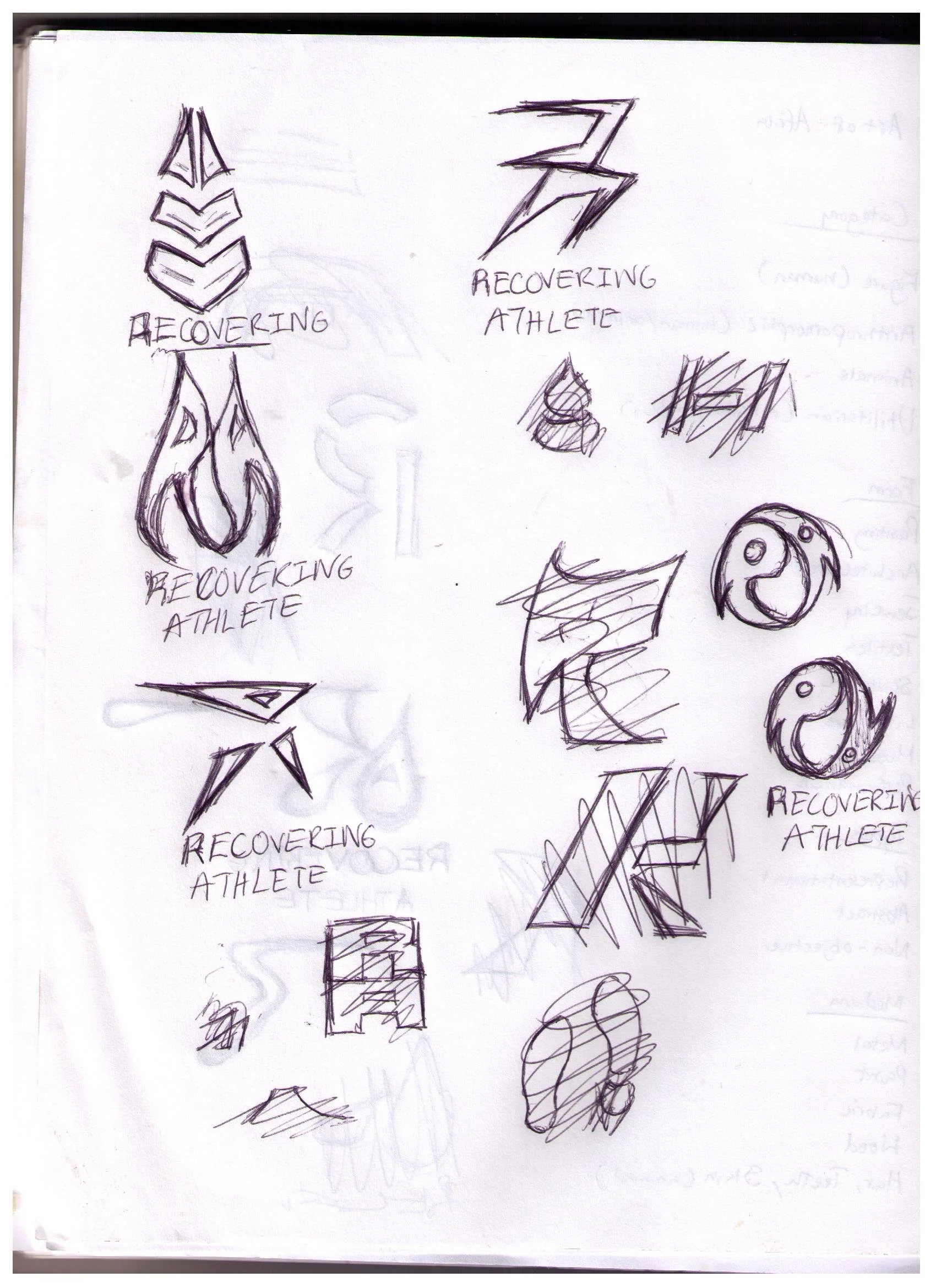
After the research, I took the time to visualize the potential logo in a series of sketches that I would present to the client. There were two concepts that I explored for what I wanted the symbol to be. First: the letters "R", and "A" stand for Recovering Athlete a simple concept that easily can make sense because it directly ties to the name of the brand.Second: use "sweat" as the logo symbol for the brand. This idea derived from a hashtag that Recovering Athletes use consistently in their social media posts called "Sweat Equity" and it also embodies the exercise of running or jogging which Recovering Athletes heavily promotes and encourages their followers to do on a consistent basis.After creating the sketches I had a nice conversation with the client to see which of the sketches we can move forward with the design process. After a short but wonderful conversation, the client agreed to go with this sketch.
Color:
The Logo Story
So the sketch that was chosen is a unique geometric shaped "R". the story behind this is that I wanted to make the letter look like it is a person running by making the legs of the letter slant diagonally to show a sense of movement like most standard sport brand logos.When working in Illustrator, I could refine it as I went along since the sketch was rough. I made the stoke the black from the color palette and the base color a gradient of a dark shade of red with a dark peach color as the accenting gradient color in the leg area.Once that was done, I wanted to figure out how to somehow incorporate the letter "A" into the logo. T The idea I came up with was to create the "A" as the shape of an arrow tip and place it on top of the "R" where the round part normally would be and have it personify a person's head.Once finished it turned out exactly what I would've hoped. I then transferred the logo to Adobe photoshop and added the effects Bevel & Emboss, Inner, and Outer glow to enhance the logo.Round 1
Logo Mark
Word Mark
Round 2
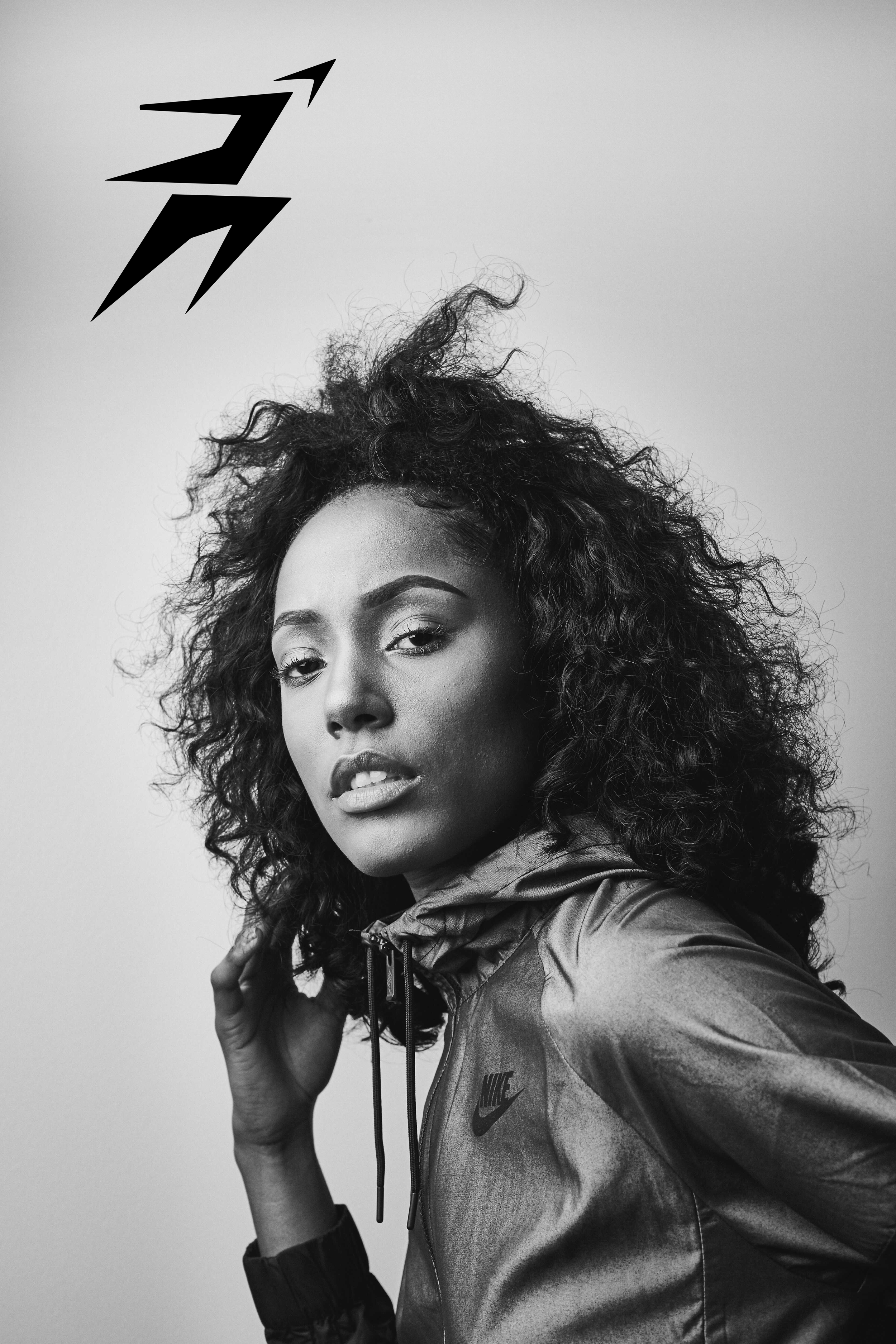
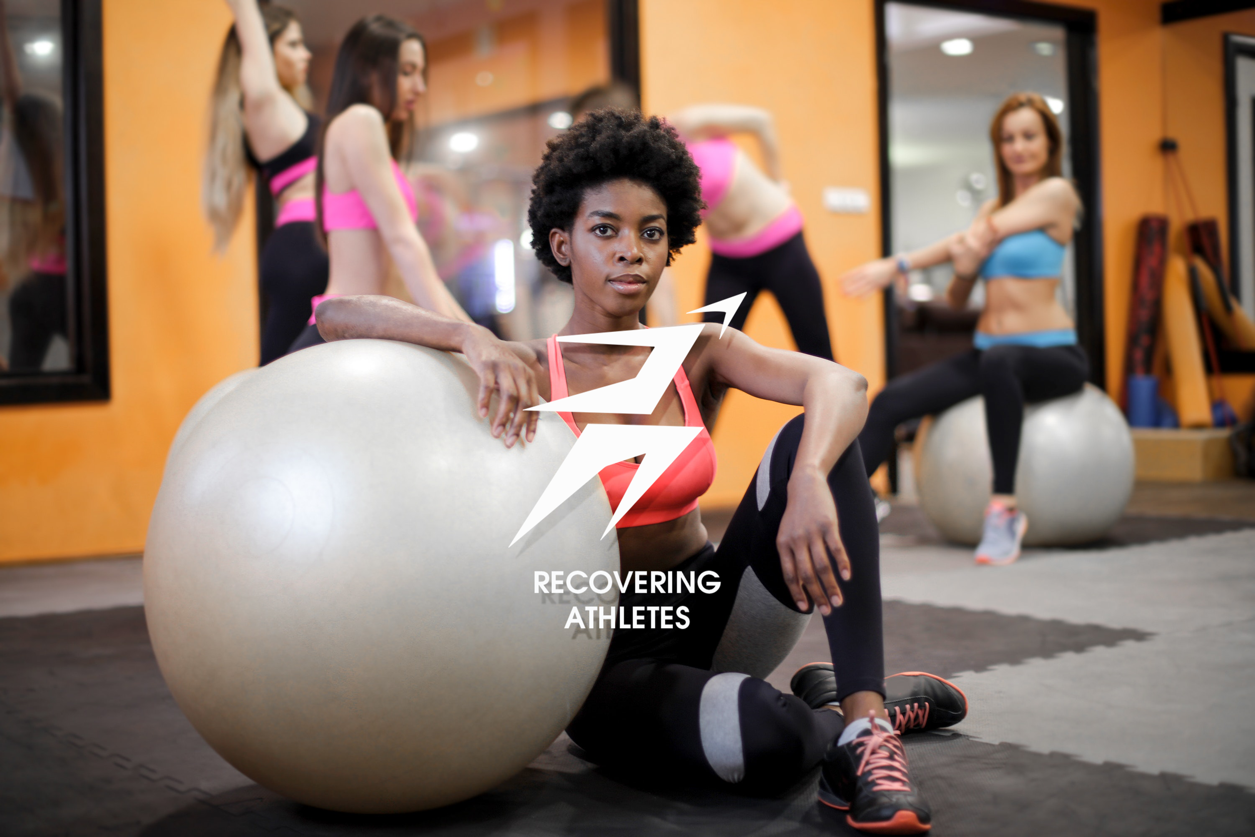
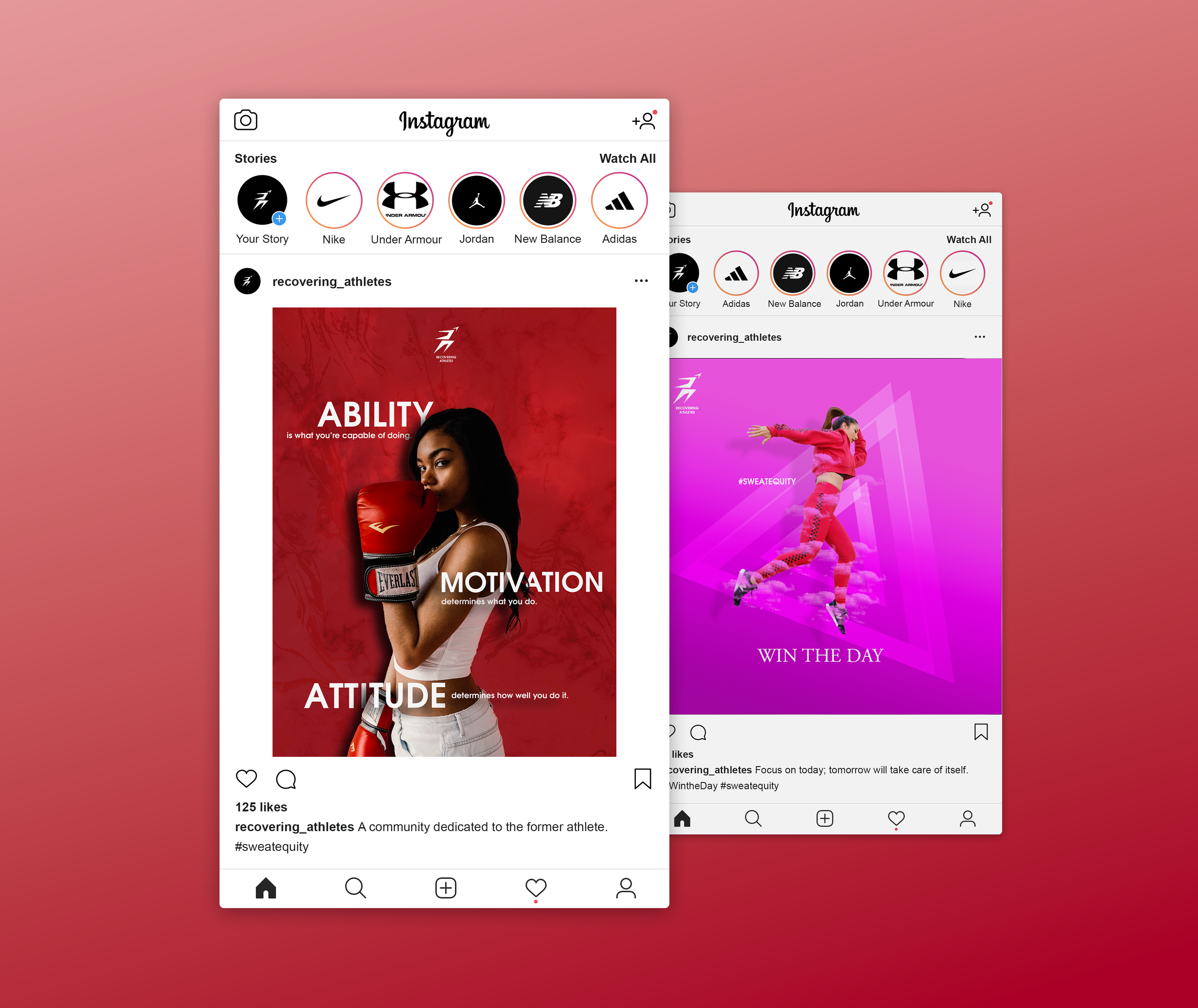
Four years later, I decided to revisit this design that I had not touched since submitting it to my client. I took feedback from professionals in the field in order to improve my design choices for the logo. Below are details on each design choice and what factors made them work and not work.I moved on from the black keyline and gradient color on the original logo due to the limitations that it would have on how it can be used. Changing the logo's size would get lost in translation, and if it is not a black or white background it just wouldn't work anywhere else.The solution was to make the logo a solid color that way the client is not limited to a single color palette, the logo maintains its presence regardless of the sizing, and it can be used in any digital, or physical medium. I also made changes to the typeface as well from the original "Engraver's Gothic" font to "Tex Gyre Adventor" because it resembles some of the cleaner typefaces that sports brands use for their logos.These changes opened up the possibilities of how this logo can be utilized especially in sports branding. Here below are the results:Final Design
Logo Mark
Word Mark
Logo Mark (Gradient)
Reflections
I enjoyed creating this logo back in 2019. Now knowing what I know now I would've approached the business side of things differently. Yes, I was hired to create just the logo and that was all that the client needed at the time. What I would've done differently was to pitch to the client about designing the entire visual identity of Recovering Athletes. Of course, rebranding wasn't the direction they had in mind to go into but I believe at least pitching that to the client would've made the project even bigger and more impactful long term.
I do look forward to working with more sports brands in the future, sports is an industry I desire to enter into as a graphic designer.  I am proud of how the logo turned out and how it put a smile on my client's face when I presented it to him.


